VAlenera real estate
Brand Identity
Michael Valenera created a real estate and consulting agency, Valenera Real Estate. Michael emphasized his desire to use his years of expertise in real estate development to help local entrepreneurs realize their dreams for a brick and mortar– not only as a realtor, but also as a consultant who can help guide them through red tapes, permits, etc.
In our conversations Michael discussed wanting an approachable and modern brand that felt rooted in the community– with a focus in South L.A.

Brand Strategy
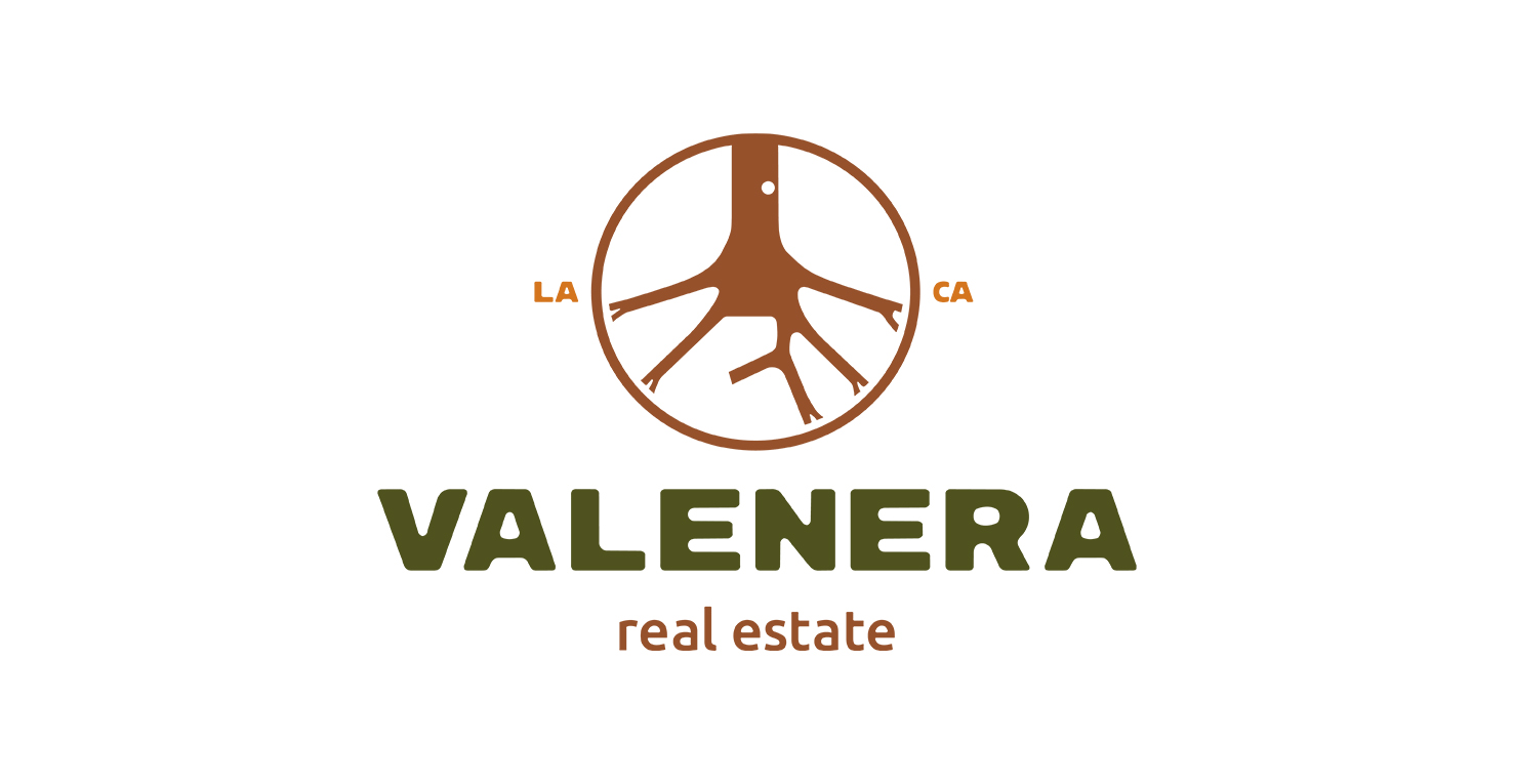
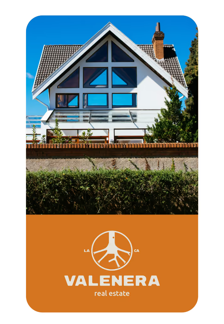
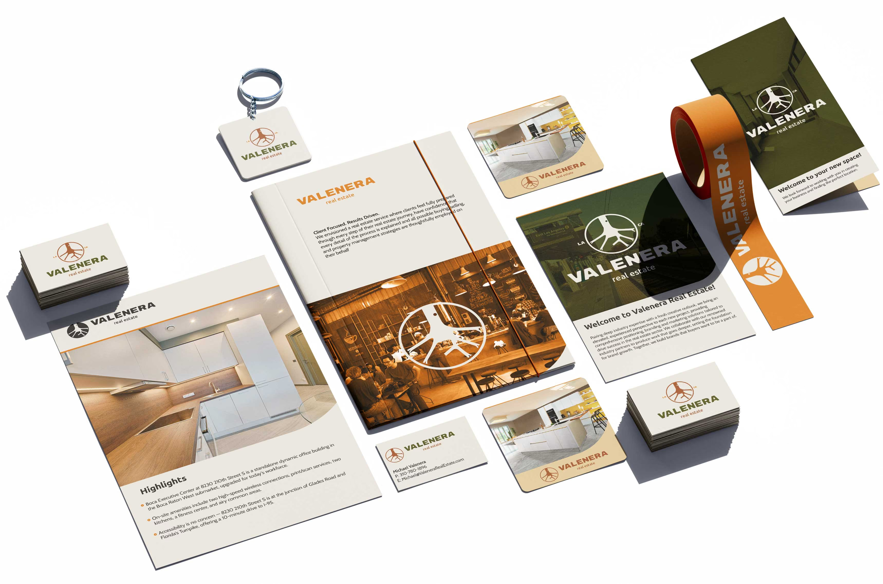
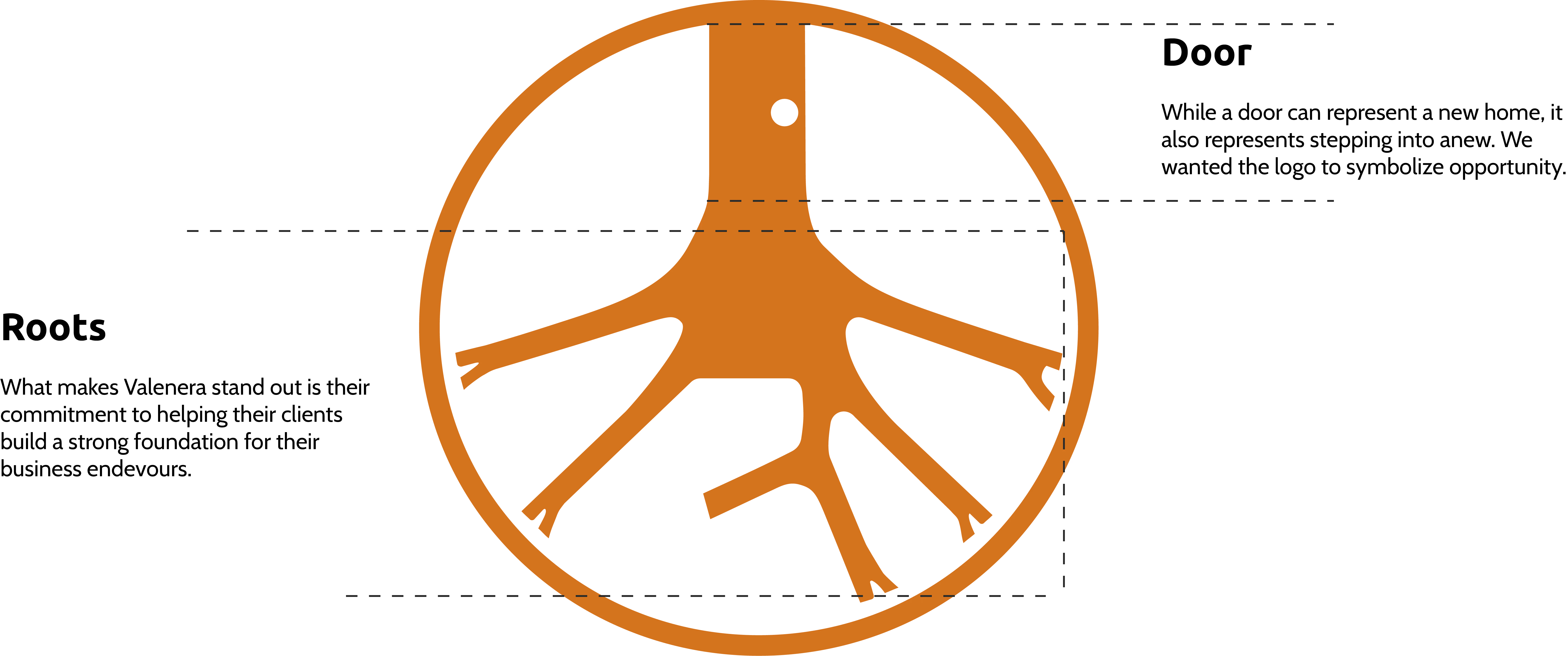
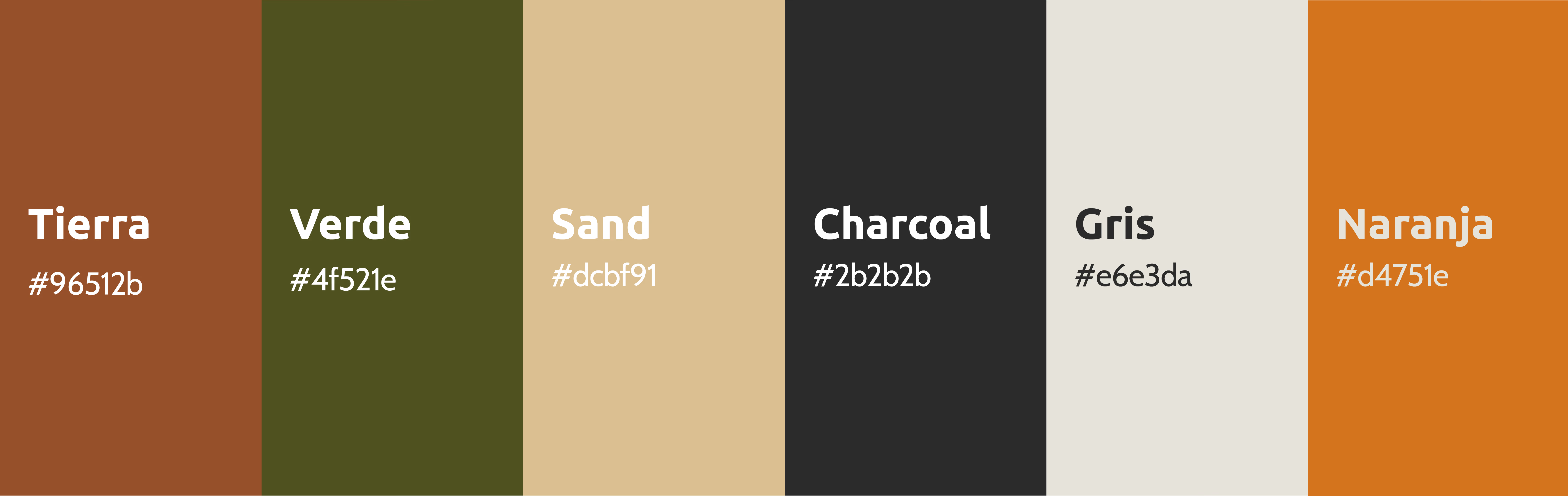
One of the main goals of Michael's was to make sure that the brand felt approachable. I created several drafts with different concepts. Ultimately landing in a roots logo. This logo represents all the groundwork that Valenera Real Estate helps develop for its clients in order for them to have a strong foundation. The colors selected feel modern and approachable without lacking professionalism.
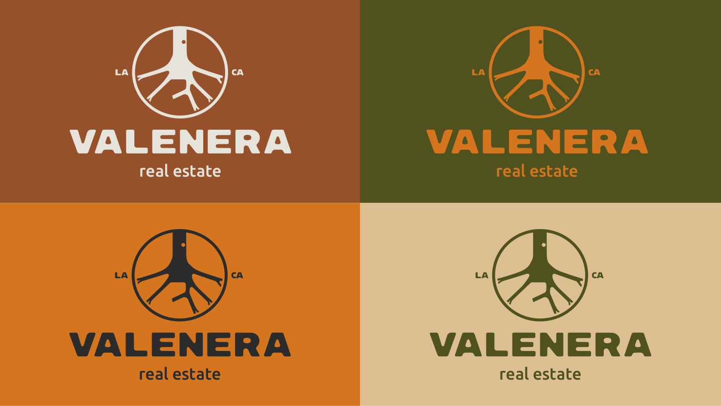
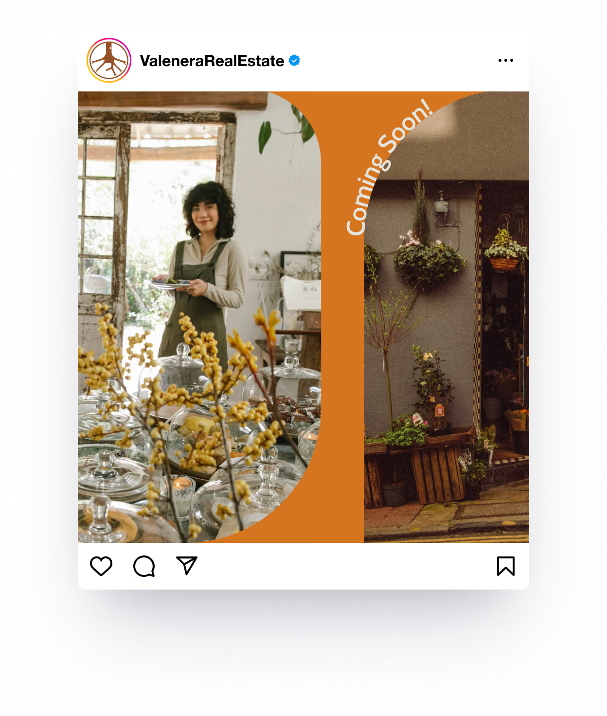
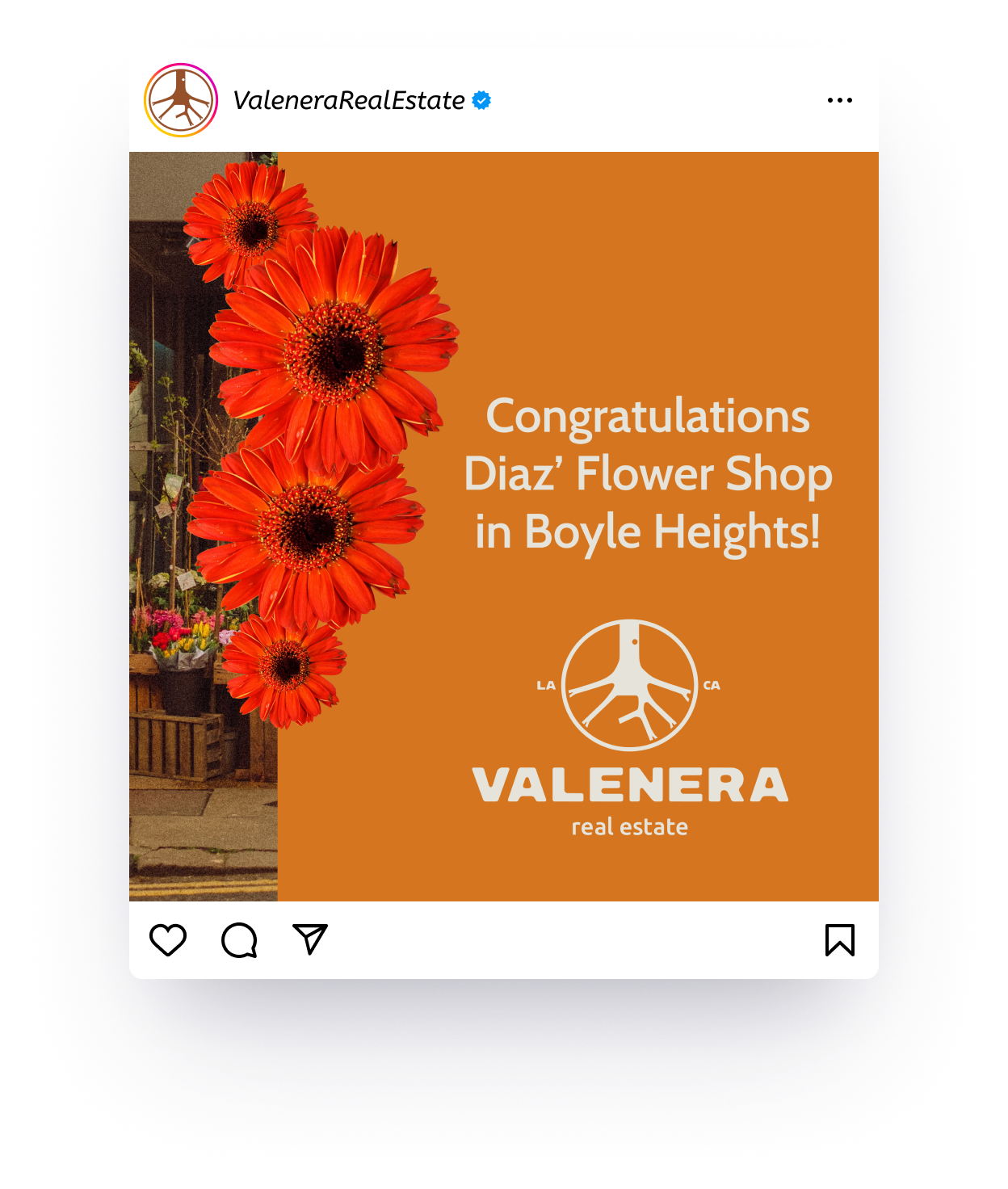
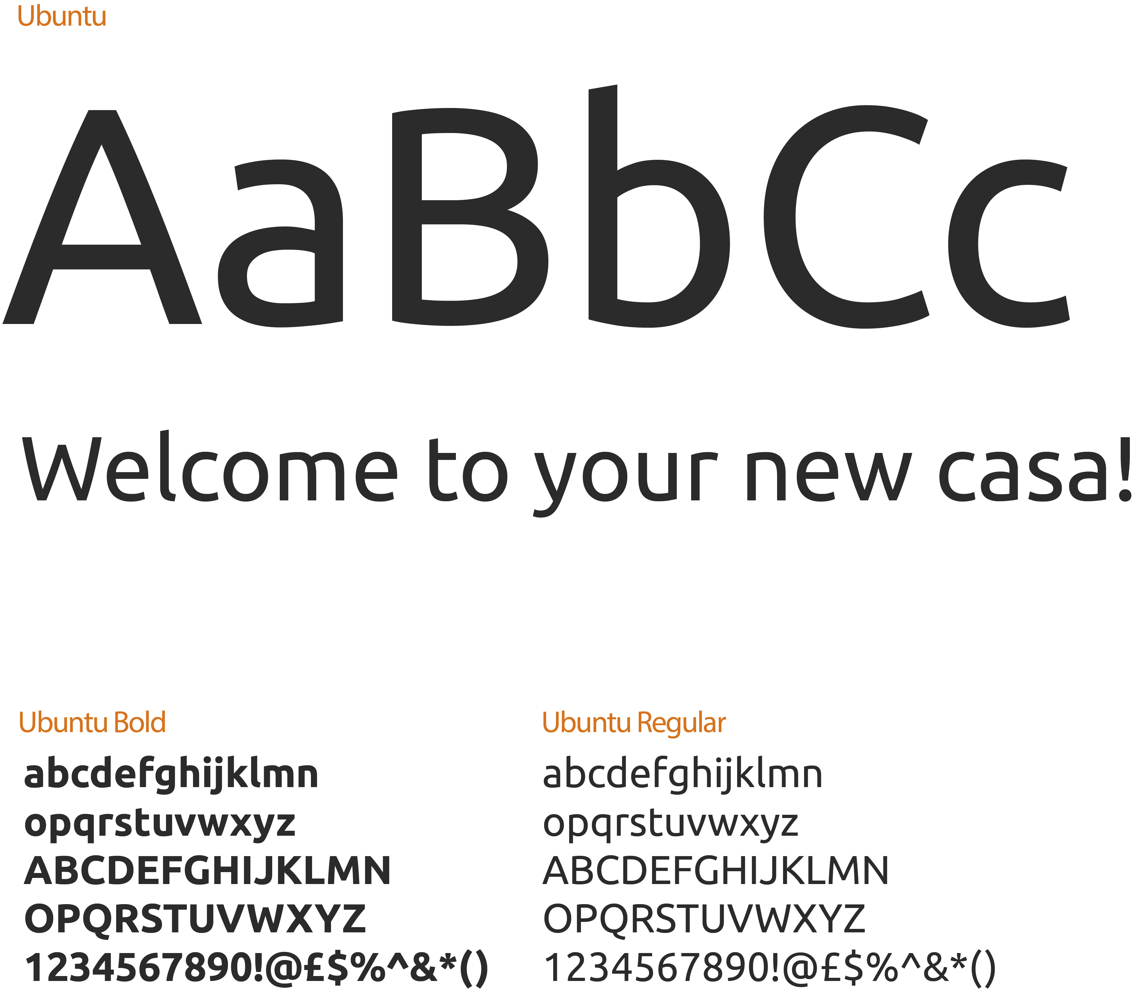
The “real estate” part of the logo is a modified Ubuntu. By continuing the use of Ubuntu into the headlines the logo and headlines create a familiarity and carried conversation. Ubuntu is only to be used for headlines and subheadlines– and buttons.
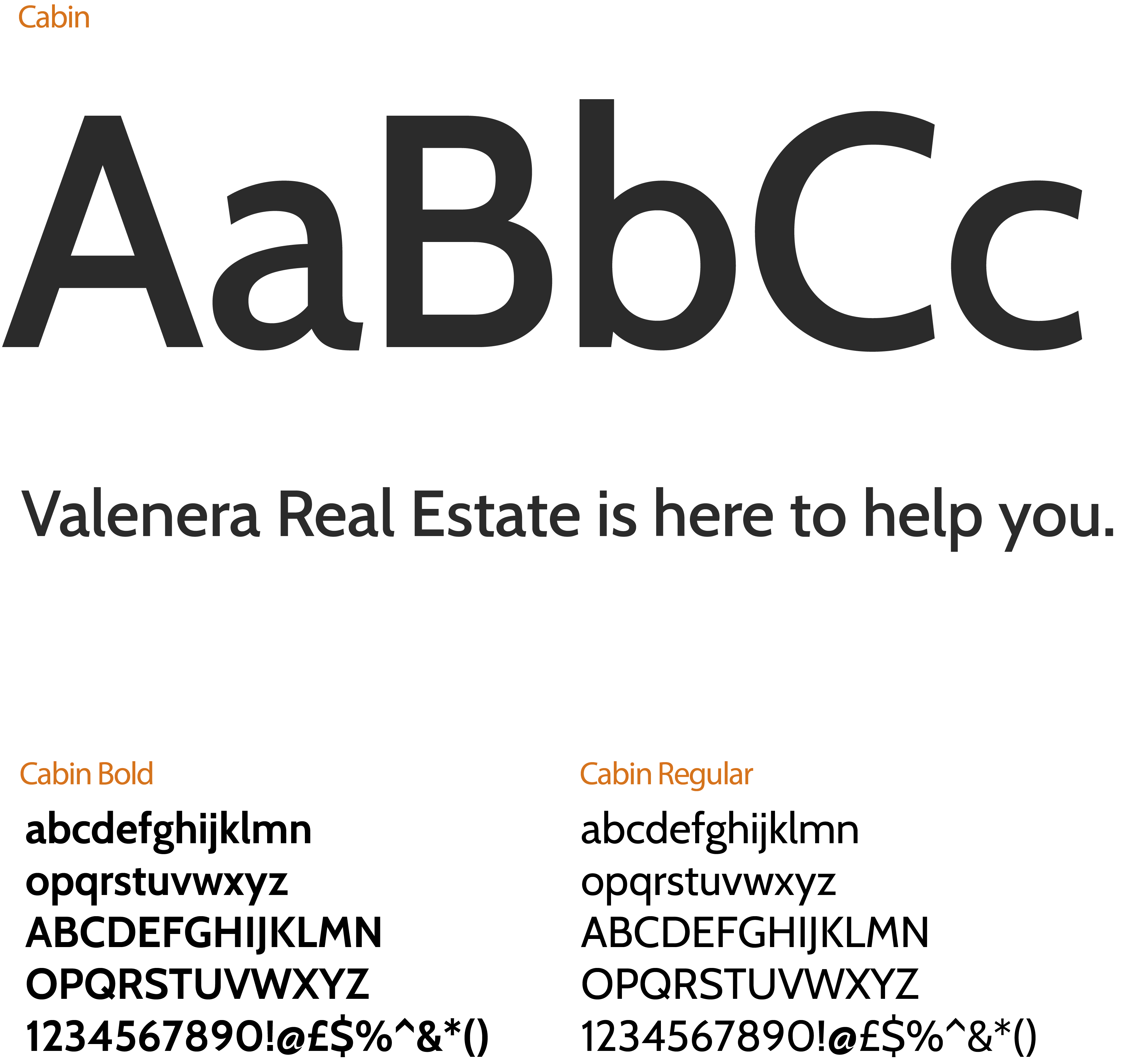
Cabin is a very legible font that is perfect for long paragraphs that doesn't feel stuffy. It’s professional look pairs perfectly with Ubuntu and the logo.